Clear Contrasts and Minimalist Design
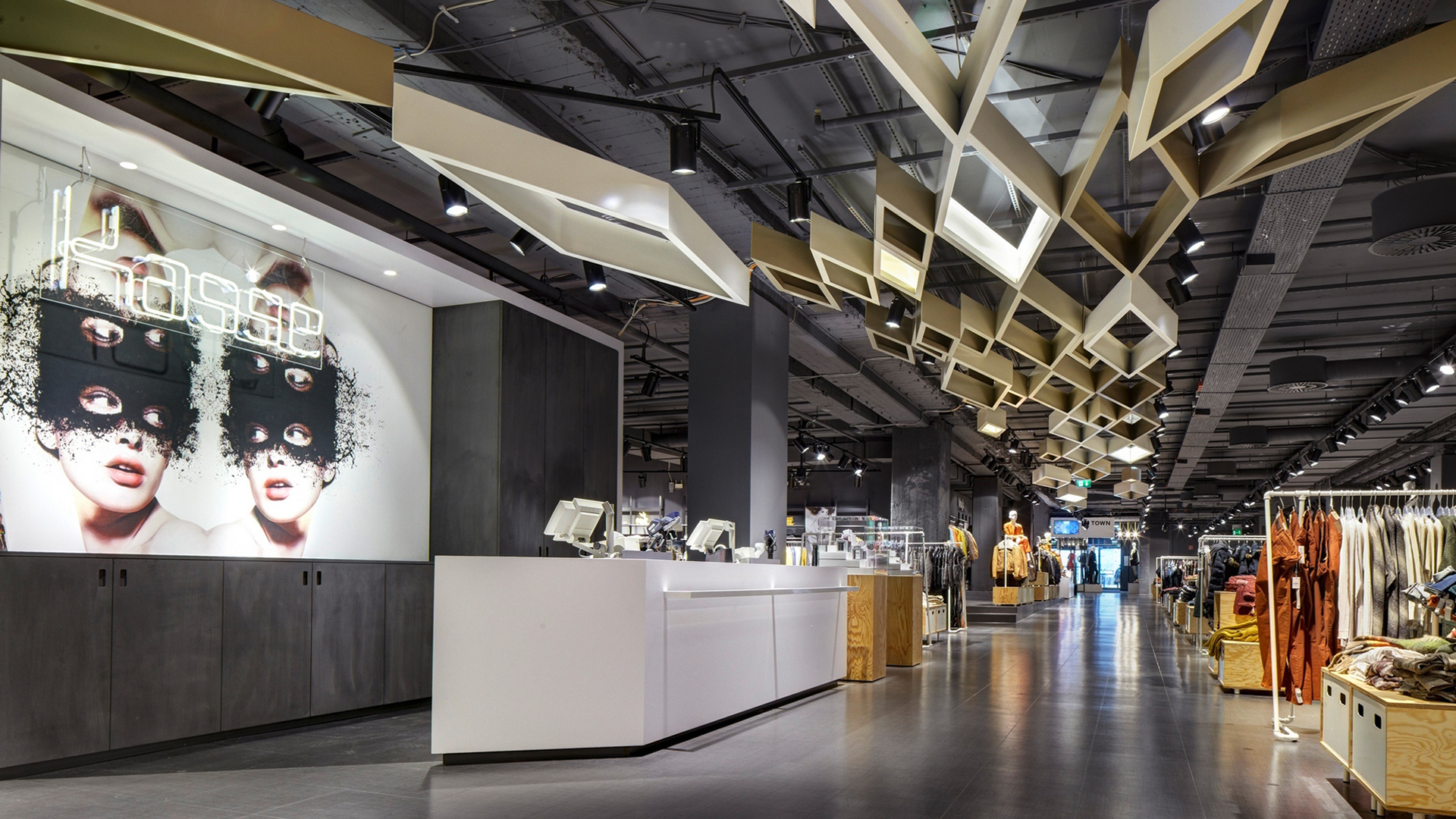
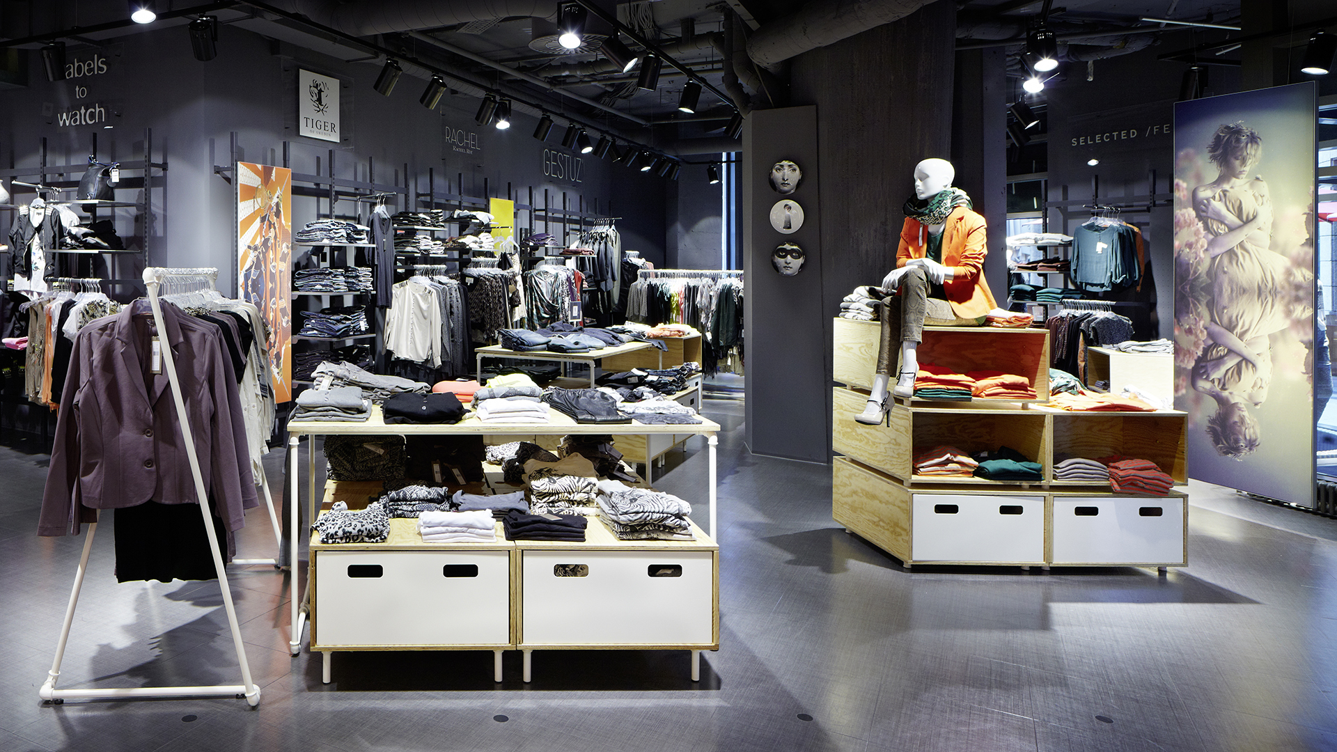
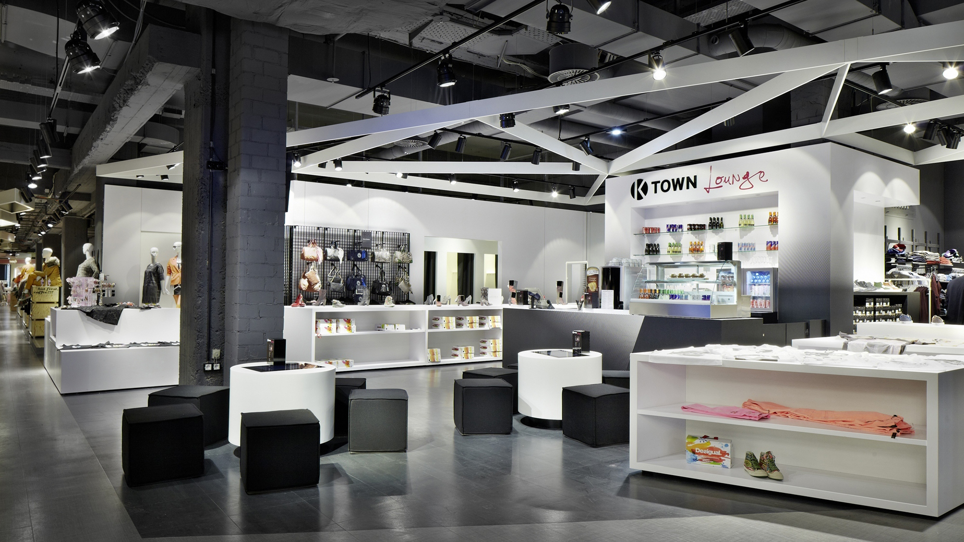
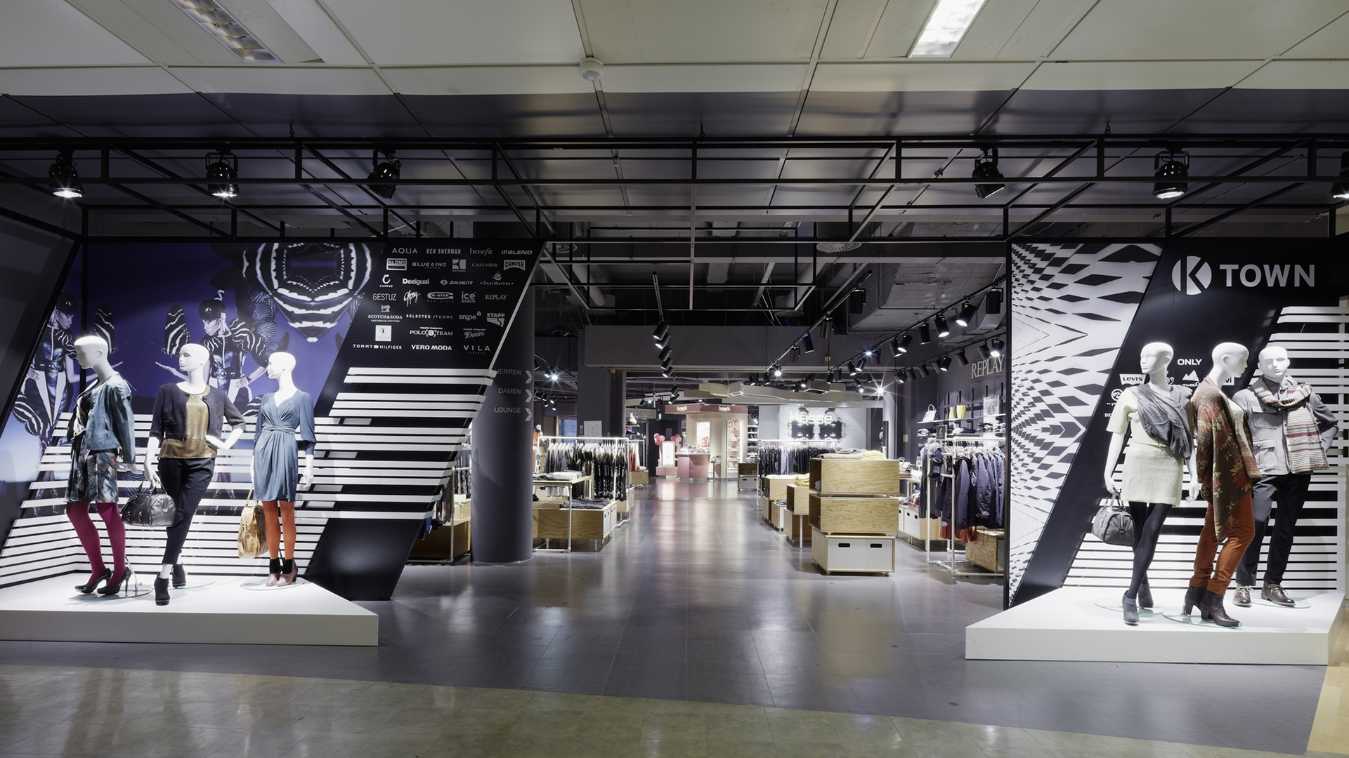
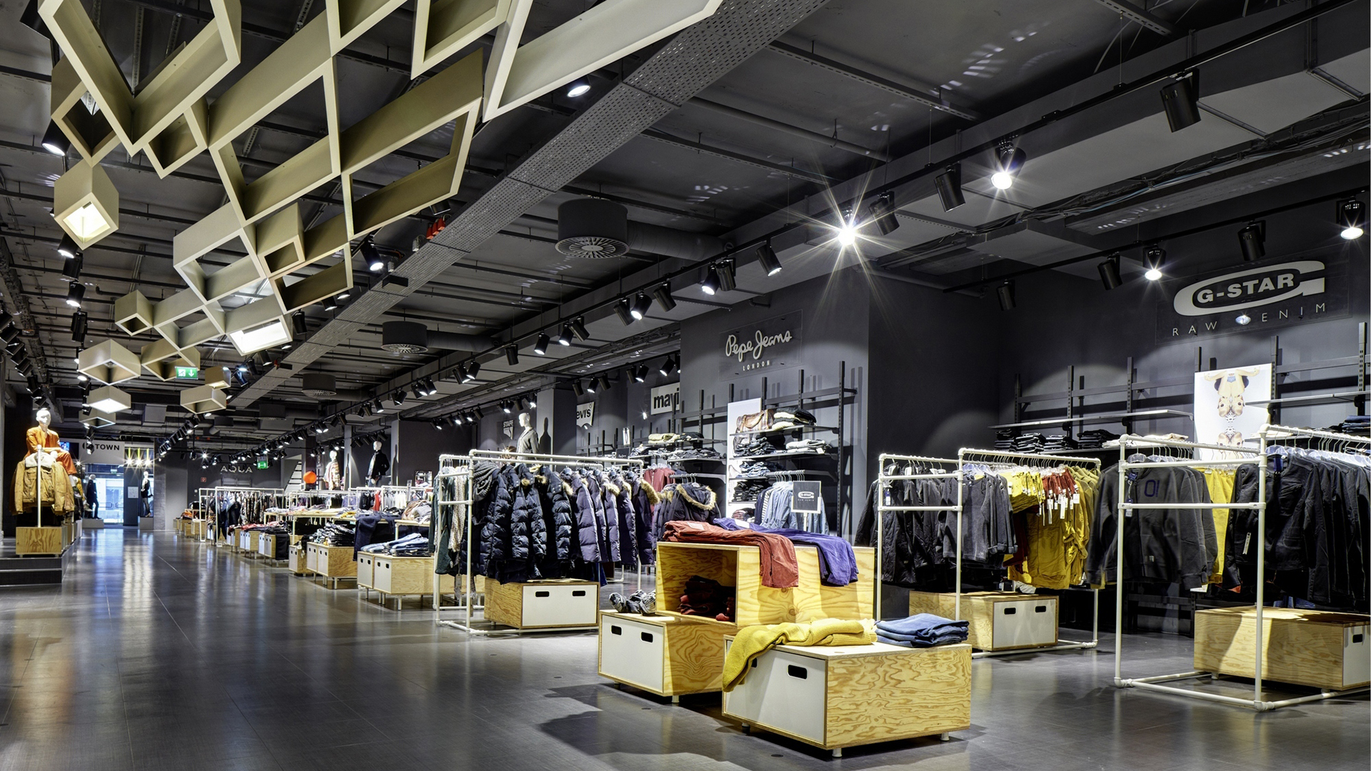
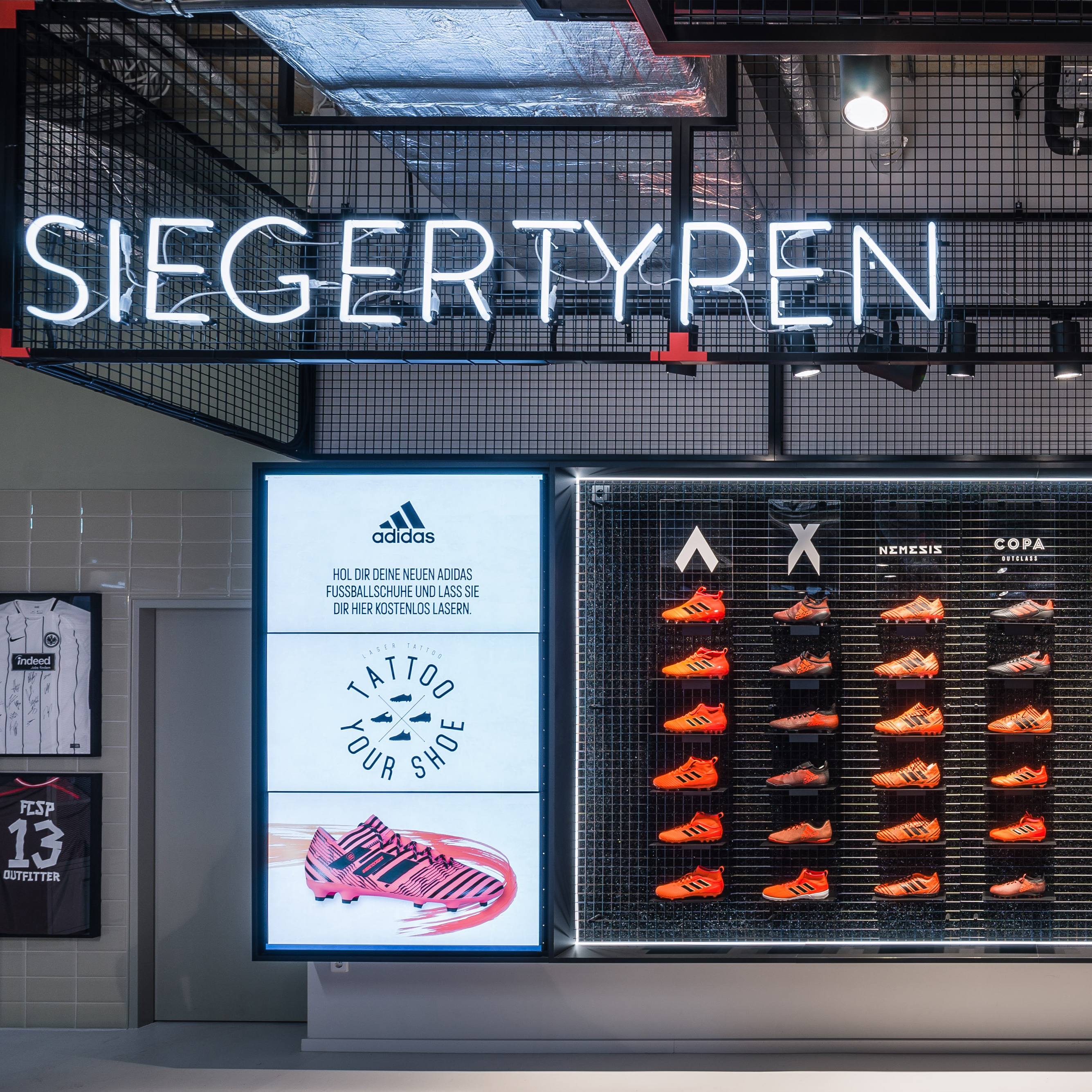
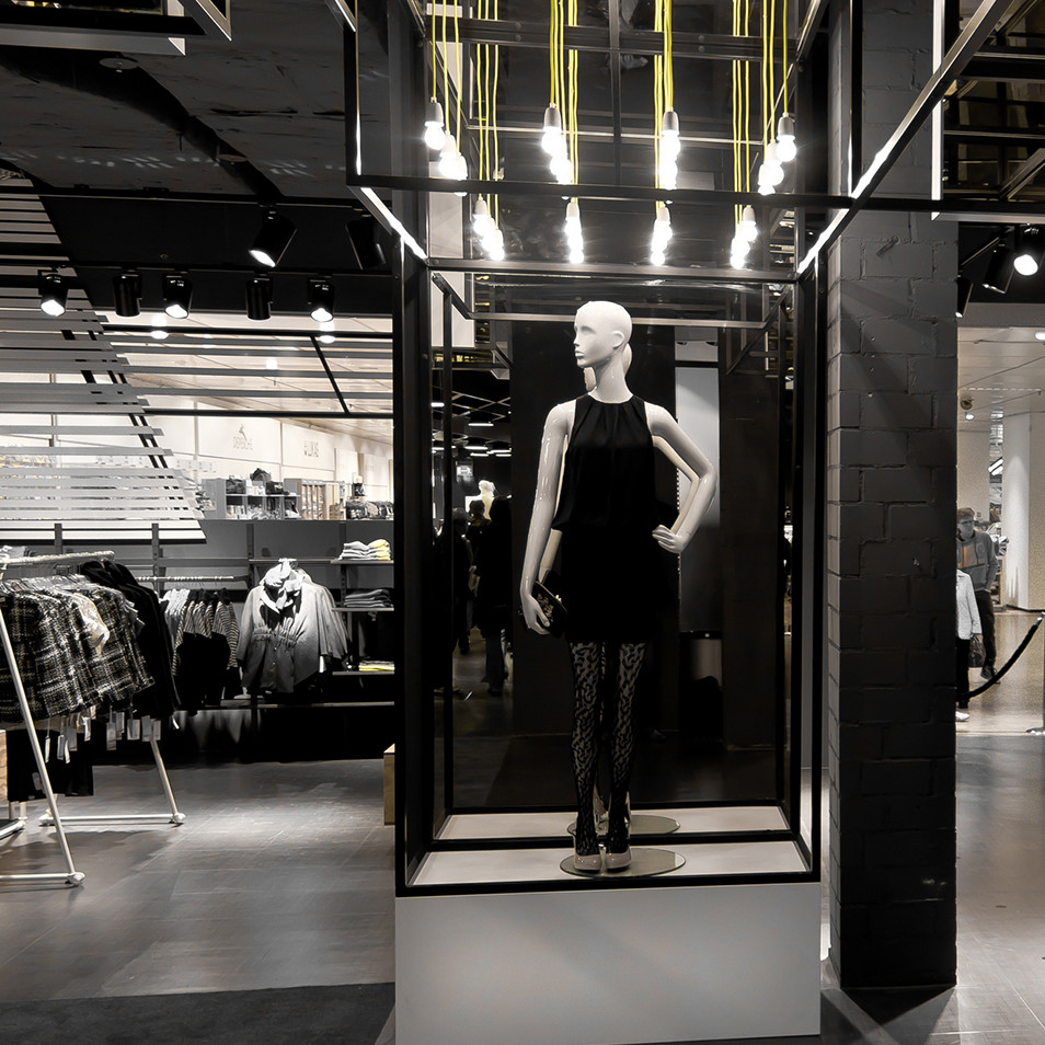
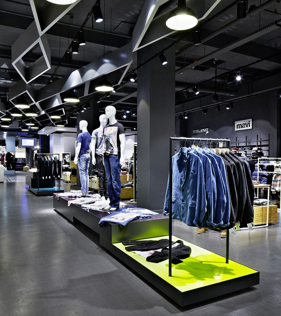
For the new K Town store, first of all the non-loadbearing structural elements were dismantled, and the remaining shell repainted in a consistent dark grey. The important thing here was to integrate the modern shop concept with the basement floor of an existing department store. We decided to go for a design where clear contrasts and a minimalist rectilinear architecture predominated. One aspect of this was the gigantic rhomboid steel sculptures on the ceiling which clearly demarcated the male and female sectors.

Get in touch!
We do everything that is needed, right down to the last detail, to make your brand a spatial experience – from the brainstorming workshop through to the conceptual planning and final handover of the completely realised brand space.
